UX Microcopy
I worked with one of Bravo's product owners to add new functionality to our web portal for wellness program participants whose reward cards were lost or stolen.
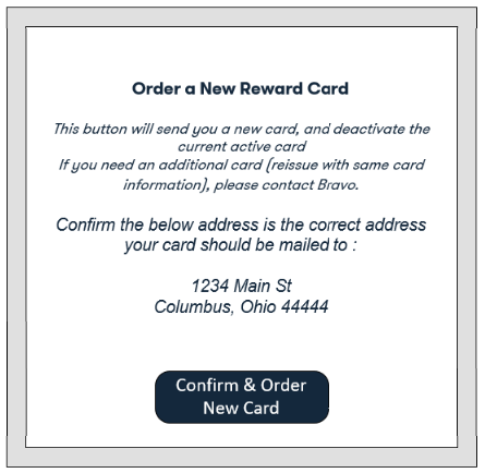
The product owner showed me a mock-up with her initial ideas for a dialog box that would open after a participant clicks the Order New Card button.

After asking the product owner some questions, I learned:
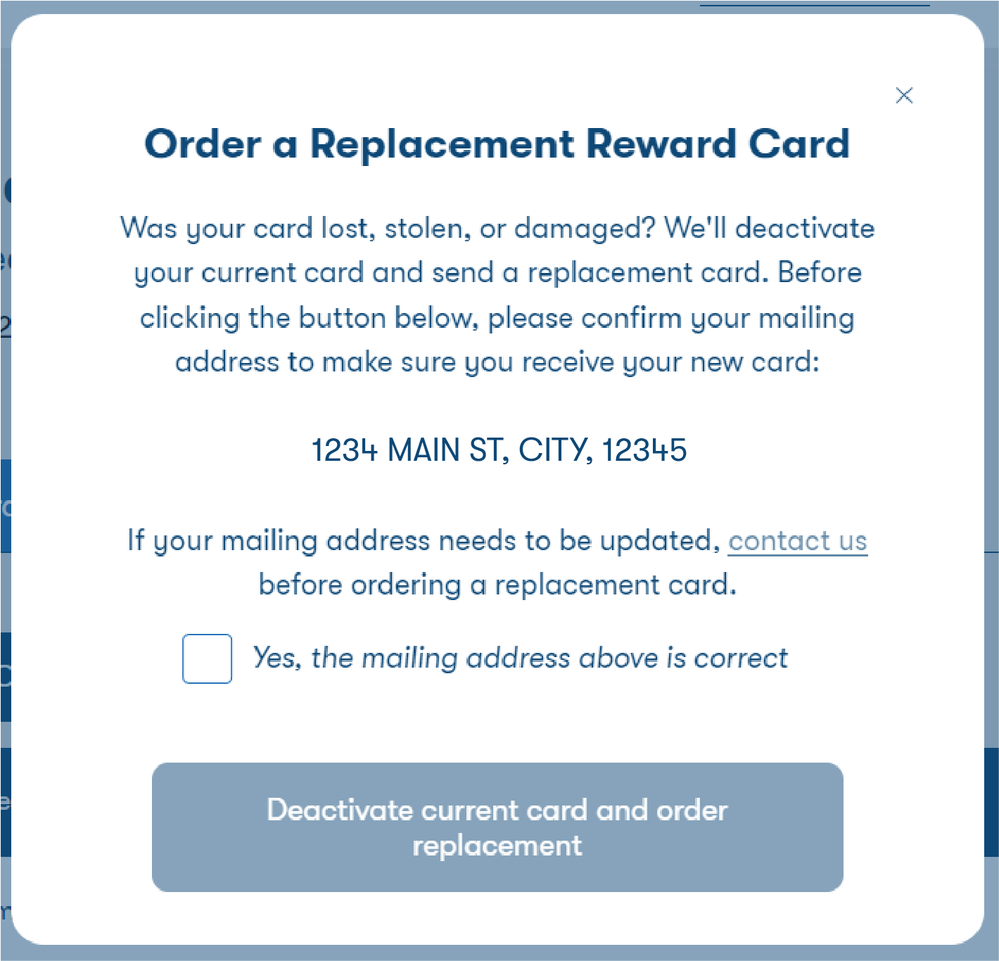
- Participants should take this action if their card was lost, stolen, or damaged
- Participants who want a second card (e.g. for their spouse) need to know not to take action here, because it will deactivate their current card
- We want participants to confirm their address on file for the card before requesting, and if it's incorrect they need to contact us first
I asked how common requests for two active cards are and if users have other ways to know what to do in that scenario, because it wouldn't be ideal to explain two separate reasons to contact us on one dialog box. I suggested that by clarifying that this option is for people whose cards were lost, stolen, or damaged, that should make it unlikely that someone wanting two active cards would click the button. The product owner confirmed that would meet the need and allow for a more clear and concise user experience.
In addition to rewriting the language for clarity and flow, I recommended requiring users to check a box to confirm their address, to make it less likely that someone clicks the button without reading any of the text in the dialog box.
I also asked if we should provide information about potential fraudulent charges on stolen cards, but the product owner said we didn't have time to get that answer from our reward card vendor.

Post a comment